Case Study
Nickelodeon Noggin
Nickelodeon Noggin
Category
Audio Logo, UX Sound Design, Branded Music
Opportunity
Audio branding for the world’s most popular kids app.
The Story
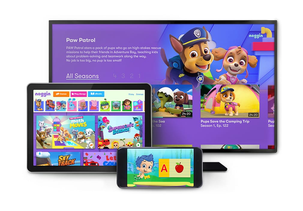
Kids learn by doing what they know best: playing games. When Nickelodeon refreshed the popular early learning sub-brand, Noggin, the team saw an opportunity to establish a new audio user experience. One that would be enjoyed by kids and parents alike. 

Conceptual Composition
Inspired by seminal childhood games (think: pat-a-cake, double dutch), we wove the
hands-on, play-to-learn mentality of children throughout the fresh soundscape. Real-life sounds like bubbling beakers and chirping birds ignite endless exploration.
Rising Harmony
Signature Melody
Playful Percussion
Moving Toys
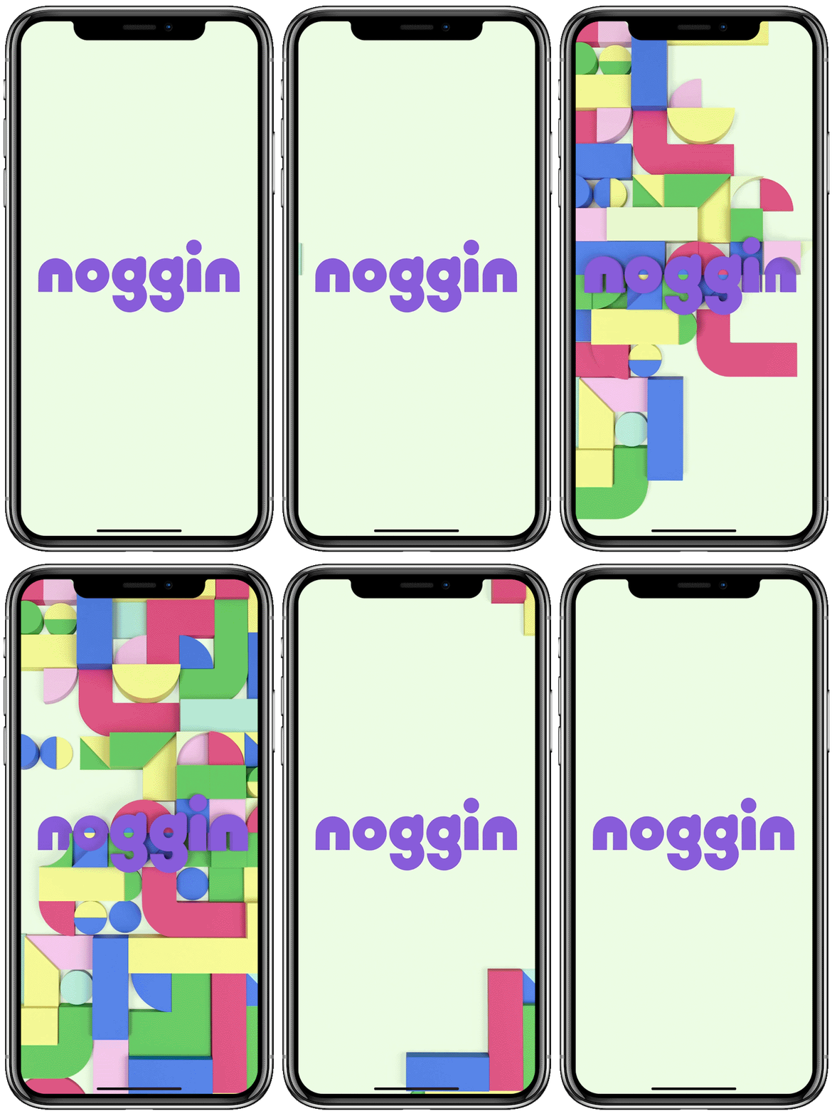
Audio Logo
The Audio Components come together to create the final audio logo, heard during the loader animation sequence of the mobile app experience.
Marquee Moments
Noggin UX Sounds have a blend of playfulness suited for the imagination of a child and the navigational functions intended for adult setup.
Launch
Onboard Complete
Alpha Button Load
Launch Content

UX Sound Suite
Alpha Button Tap
Alpha Button Refresh
Select IP
Back
Pick Favorites
E-Books
Games
Playalongs

Sonify Your Story
